Subsections

2018-06-02 Measuring Sea Level Averages Using RADS

I was recently tasked by a client to generate graphs of the Global Mean Sea Level (GMSL) by latitude. This proved to be rather tricky, as the tool, Panoply, which my client had referred me to was not designed for the task. Instead, I had to do a bit of digging into a rather complex subject before eventually finding a tool, the Radar Altimetry Database System (RADS), which would provide the required data points. It then took a bit of wrestling with Gnuplot in order to properly graph the data. This provided graphs similar to those published by the University of Colorado, giving me some confidence that my methods were correct.

Panoply and Tide Gauge Measurements

My task began with the Panoply tool and a link to a rather large amount of data. However, at the time, several of the datasets, such as this one, that I tried to plot threw an error because there were "multiple entries with the same time value"; this was due to the process that appended a new year's worth of data to the dataset erroneously repeating the last record from the previous version of the file, but the dataset has since been fixed by its maintainers. Upon finding a dataset that did not contain duplicate points, however, the program then proceeded to crunch numbers for the next 50 minutes on my poor, old computer before I grew tired of waiting and killed the program.

Mildly perturbed by the issues I'd been having, and also concerned about the feasibility of automatically processing and aggregating the data for each of the many stations using a Graphical User Interface (GUI) program, I decided to look at Python tools for dealing with the raw netCDF-formatted data. I ended up trying out the pydap module, using it to fetch and processes a single netCDF file at a time from a specific HTTP URL (example); to my great consternation I did not have any luck when providing providing the module a local URL (file://). Trying to average the data rapidly proved to be non-trivial, as the data was both plentiful, non-contiguous, and oscillating. I eventually managed to hack something together, but its validity was rather questionable, and it remained an open question how to deal with both fetching all datasets over HTTP (feasible, but possibly hacky) and averaging all datasets (probably PhD-level numeric analysis).

It was also becoming rapidly apparent to me that tide gauge data was entirely insufficient for the task at hand. The main reason for this is that tide gauges provide data for the Relative Sea Level (RSL) at the gauge; this is a problem because factors like Glacial Isostatic Adjustment (GIA), which causes the land to rise relative to the sea, as well as other factors cause each gauge to be representative of its local area only rather than the ocean as a whole. While methods have been developed to approximate a GMSL in spite of these difficulties, I didn't have the time to dig through all of them, and finding the occasional paywall when searching for articles that may or may not contain the algorithms I'd need was rather disheartening. It was also becoming clear to me that there was another method for measuring GMSL besides tide gauges: satellite altimeters.

RADS and Satellite Altimetry

Since 1992 a series of satellite missions has collected oceanography data using altimeters. The missions, in chronological order, are: TOPEX/Poseidon, Jason-1, Jason-2, and Jason-3. Processing the data can be done using the RADS tool, whose source is freely (as in freedom) available.

Compiling RADS was simple enough for me, albeit likely non-trivial to a novice GNU/Linux user due to a dependency issue; specifically, RADS requires the netCDF library with Fortran 90 support compiled in as mentioned in the RADS README file. Trying to compile using the provided libnetcdf-dev on Ubuntu 14.04 LTS failed due to missing Fortran 90 support, and checking the build log shows checking for Fortran flag to compile .f90 files... none, thus I needed to manually provide Fortran 90 support. I was able to get this working by downloading the netCDF library from some long-forgotten location and enabling Fortran 90 support with ./configure –enable-f90, then telling RADS to configure against this library via ./configure –with-netcdf-lib=/path/to/netcdf-4.1.3/liblib –with-netcdf-lib=/path/to/netcdf-4.1.3/fortran –with-netcdf-inc=/path/to/netcdf-4.1.3/f90. After fixing the dependency issue I had no problem building and running RADS.

Unsurprisingly, the RADS software doesn't come bundled with the satellite data. This is a good thing, because there is lots of data; the data for the above-mentioned satellites currently takes up 200 GiB, but note that there is also data from other satellites, and the data will only grow with time. In order to get the data one must follow the instructions in the RADS User Manual, the exact steps will not be detailed here. I decided to place the data under /usr/local/share/rads so that it would be accessible system-wide.

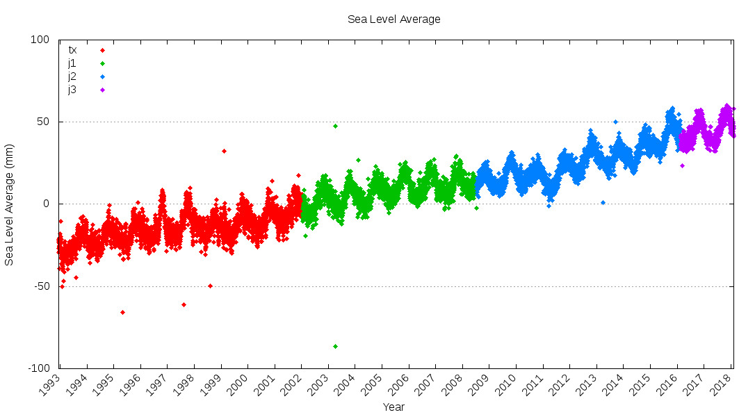
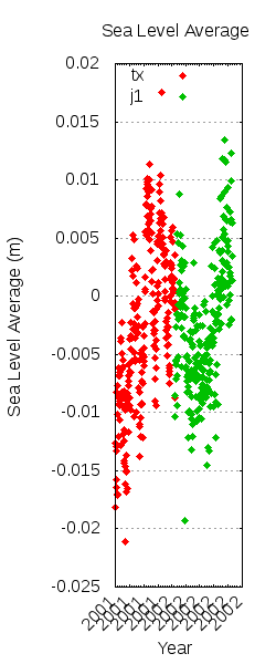
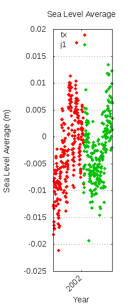
The RADS tool itself consists of a series of subcommands such as rads2asc, which takes the satellite data and turns it into text (ASCII) format. Note that the RADSDATAROOT environment variable must be set before invocation, otherwise the tool won't find the data. The tool allows one to specify what data one is interested in for output; in my case, the -V sla option provided data for Sea Level Average (SLA, which, when taken globally ought to be equivalent to the GMSL), the –ymd begin,end command allowed me to specify a date range, and the –lat min,max option allowed me to process the data by latitude as my client had requested, awesome! Oddly enough, the inclination of the satellites means that no data has been gathered at +66 or -66 degrees latitude. I will discuss a few things that I learned about graphing the data in the next section; for now pretend that the data has been graphed satisfactorily.

Processing the data this way produced graphs that were surprisingly different from those published by the University of Colorado, so I contacted the authors to see what could be causing the discrepancies. It turns out that generating an unweighted average causes the extreme (higher/lower) latitudes to be oversampled due to satellite inclination; the solution is to use radsstat, which divides measurements into a series of grids and then computes a weighted average of the grids, giving a more accurate result. Likewise, I had been sampling by day, but the complete cycle for a satellite is approximately 9.91 days, so any single day might overweight certain regions and underweight others; the solution is to use the -C start,end option to measure by specific cycles rather than dates (a list of satellite cycles can be found here). Changing these things helped align the graphs that I generated with the aforementioned, published ones.

There are tons of features that RADS that I have yet to explore. Since calculating the GMSL involves many factors that one may or may not wish to correct for, and many models which provide corrections as best they are able, RADS allows the user to specify a custom configuration file detailing which corrections to use and how to apply them. I did not get this far in my work, as I currently have no idea which corrective models to apply.

Gnuplot and Graphing the Data

Gnuplot is one of those powerful tools that I would not describe to anyone as "usable"; perhaps there's a trick to it, but I've yet to feel particularly comfortable with it and everything that I have learned thus far has taken a fair bit of work. That being said, it's proven quite capable, though I had to learn a few new tricks in order to graph the satellite data properly, namely: sectioning, legend titling, and x-axis time. Note that most of the graphs displayed in this section were generated before applying the statistical corrections of radsstat (detailed above) and thus their data is not accurate.

Figure: Left: The graph before datasets, middle: datasets indexed carelessly, right: datasets and indexed properly (kind of).
Image 2018_06_02_datasets_before Image 2018_06_02_datasets_midway Image 2018_06_02_datasets_after
Though all of the satellite data used is measuring the same thing, the Sea Level Average (SLA), the data comes from different satellites and it is useful to visually display this in the graph. Luckily, Gnuplot has a concept of data sets, which are separated by pairs of blank records in the input file (
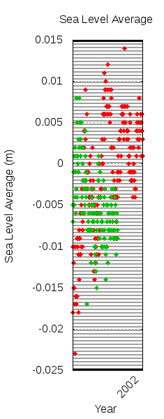
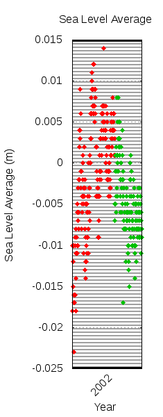
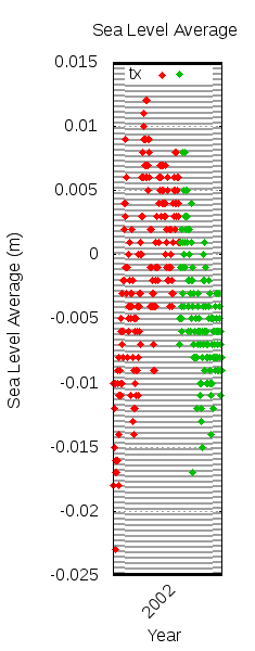
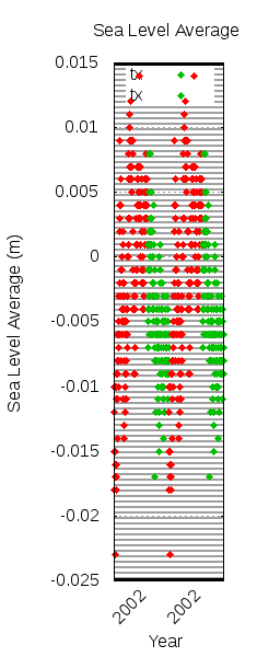
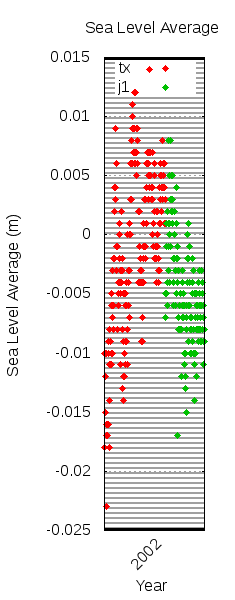
\n\n); plotting with index 0::1 then plots each data set. The next step was to give the data some color, which was done by setting the linetype of each index to the desired style (13 on my system) via set linetype 1 pt 13 and set linetype 2 pt 13 and then enabling colors by plotting with lc variable and changing the using specifier; since my data was in CSV-format with the first column being a sparsely-filled year label (as in, the first column was either blank or the first datapoint of the year) and the second column being the data, the specifier was changed to 0:2:(column(-2) + 1):xtic(1). The problem with this specification, however, is that the first specifier, which is the position of the item in the data set, is reset for each data set, thus each satellite's data overlaps as in the above middle graph. The solution was to set a variable, col, before calling plot via col = 0 and then replacing the specifier with an expression that increments col: (col = col + 1) instead of simply 0, but see below for a more accurate solution.

Figure: Left: Single plot legend with weird grid distortion, middle: careless double plot, right: multiple plot done properly.
Image 2018_06_02_legend_before Image 2018_06_02_legend_midway Image 2018_06_02_legend_after
Adding a legend also proved to be rather tricky. The good news is that Gnuplot allows naming data sets by adding a row containing the name of the data set to the top of the data set, then it was a simple matter of telling Gnuplot to use the data set names by specifying set key autotitle columnheader and set key left top in order to set the location. Unfortunately, this produced a legend where only the first data set appeared in the legend, and it created a weird visual distortion in the grid. The solution for this was to plot each data set separately; thankfully, this didn't mean running multiple plot commands but instead it meant using Gnuplot's stats command via stats 'data.dat' using 0 nooutput in order to get the number of data sets and then using the iteration feature within the plot command. Using iteration was tricky; it meant replacing a simple plot 'data.dat' with plot for [i=0:(STATS_blocks - 1)] 'data.dat'; this plotted all data sets twice (since there are two data sets in the input file). In order to plot each data set once I had to replace the index specifier index 0::1 with index i. I then set the title with title columnhead(1). It's still a mystery to me why the grid distortion occurred and why iterative plotting fixed it. Preventing the datapoints from overlapping the legend was a simple matter of changing the y-axis ranges, which wasn't done during this testing phase.

Figure: Left: Gnuplot places time-formatted xtics where it pleases, right: xtics manually specified at the beginning of the year.
Image 2018_06_02_timefmt_before Image 2018_06_02_timefmt_after
Using an incrementing col variable for the x-axis values was a decent hack, but it didn't take into account days with missing data or days with multiple sets of data, such as the days when the final cycle of one satellite ends and the first cycle of another satellite begins. Thankfully, Gnuplot can gracefully handle time-based data; I began by using set xdata time in order to tell Gnuplot that the x-axis data was time based, followed by set timefmt "%y%m%d" in order to tell it the format of the time data (2-digit year, 2-digit month, 2-digit day), and finally set xtics format "%Y" in order to label the x-axis tics with a 4-digit year number. Strangely, and annoyingly, enough, running this then gave me the error, Stats command not available in timedata mode, which made plotting datasets via i=0:(STATS_blocks - 1) impossible, so I moved the stats command before set xdata time and saved the STATS_blocks value into a variable for use in plotting, which worked; go figure. This worked, but, as can be seen in the above graph on the left, also caused Gnuplot to place too many tics in unknown locations (I only wanted them at the beginning of a year); the solution that I came up with was to manually specify which tics I wanted via set xtics ("920101", "930101", "940101", ...), which was cumbersome, but it worked well enough.

Conclusion

Figure: Graphing all Sea Level Average (SLA) data in RADS.
Image 2018_06_02_final
Combining RADS with my Gnuplot script finally gave me the results above. Note that the graph currently retains seasonal signals, causing the data to oscillate in a predictable manner. There are also many more avenues to explore; my work here only touches the surface of what RADS is capable of. For example, as detailed in the Data Manual, there are many different types of corrections which can be applied to the data, specified in RADS via a configuration file. As I had no reason to tweak these parameters, I assumed that the defaults used were good enough, and I am currently pleased with the results thus far.


Generated using LaTeX2html: Source